*
Hello dear Steemians,
I would like to present you today my series of practicing to mix different colors on paper. For that exercise I decided to choose Venice as a practicing reference. We all love Venice due to its Architecture and also there are so many of possible photography.
First it was a test to combine different colors and see what matches better and of course the paper. My few attempts of light paper did not work as the colors were out of control and paper waved heavily. Then I used rough paper and it was better due to relief if holds better water between fibers.
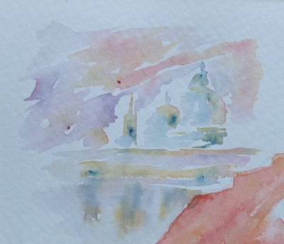
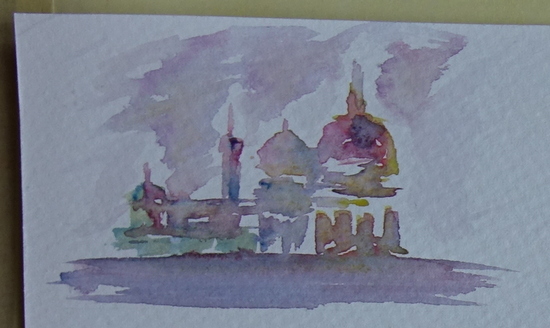
What I noticed when I did smaller paintings and just quick sketch without caring much about shapes and color intensity those ones came out pretty and I liked them. But once I decided to do it on a bigger format I noticed that I was too slow and that is why the colors had not much time to mix.

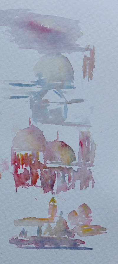
Process steps:

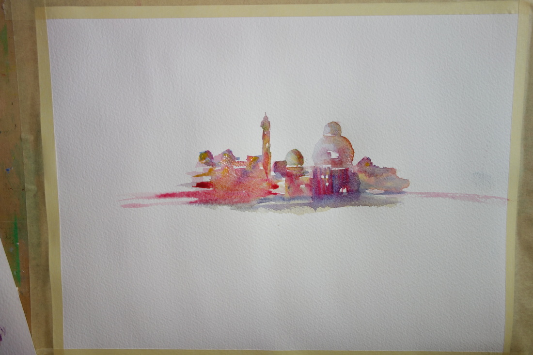
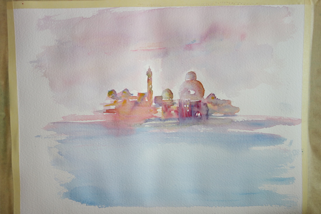
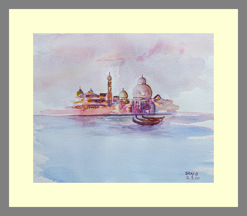
Final painting
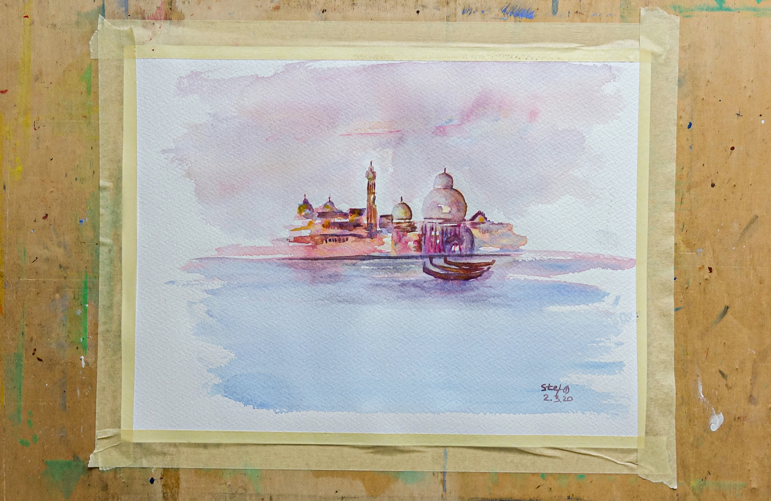
Watercolor painting „Venice“ by @Stef
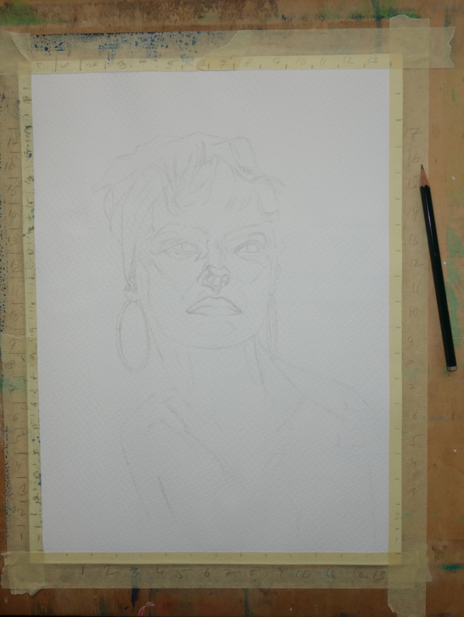
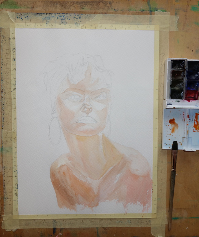
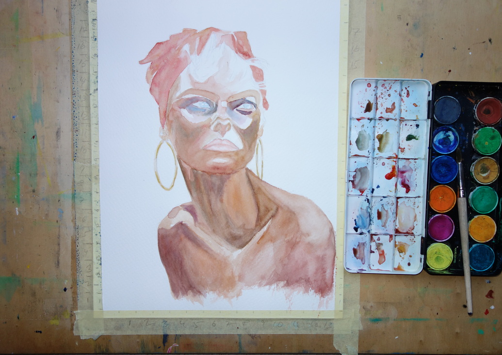
The same time I started another portrait exercise with watercolor, that it still in process and where my practicing continued I am excited about the result if it.
Process steps
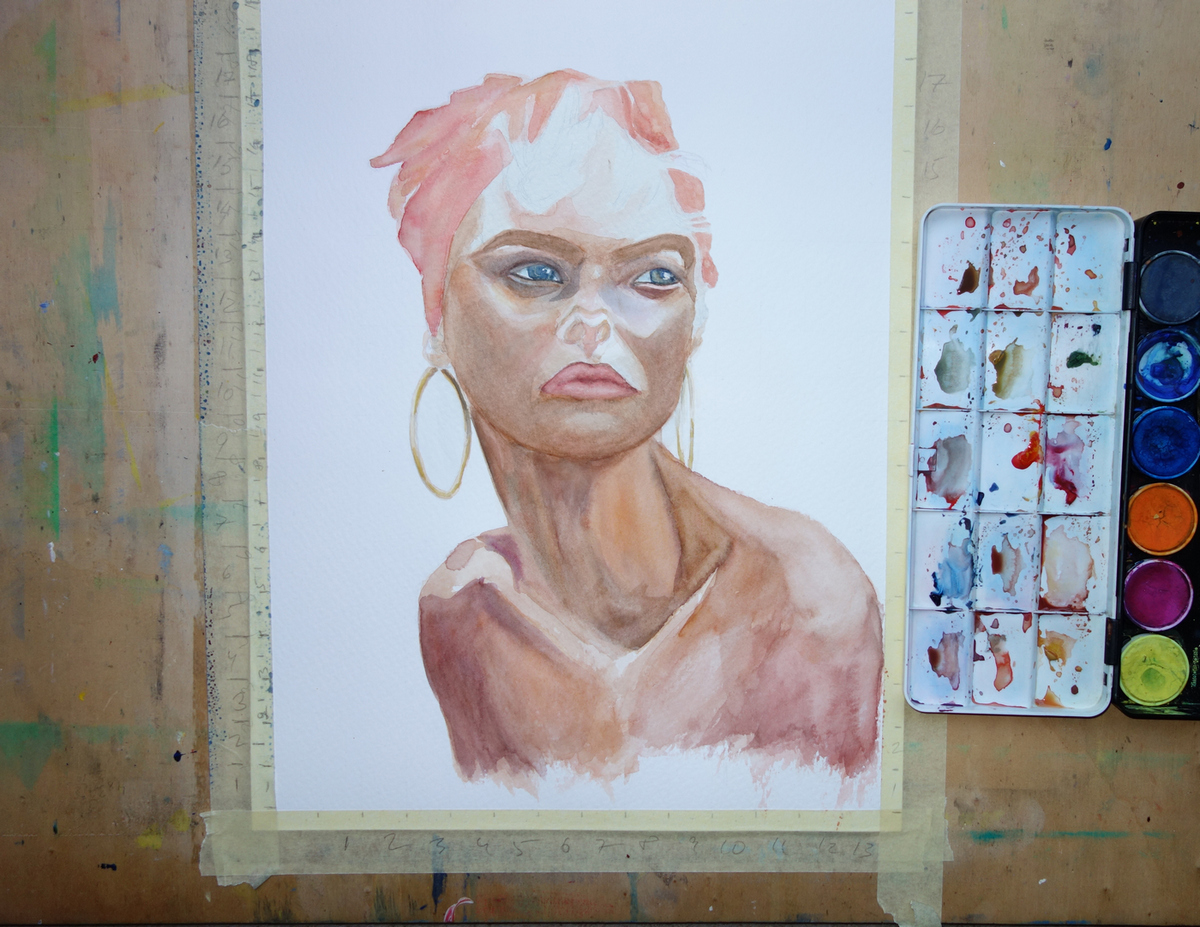
to be continued……..
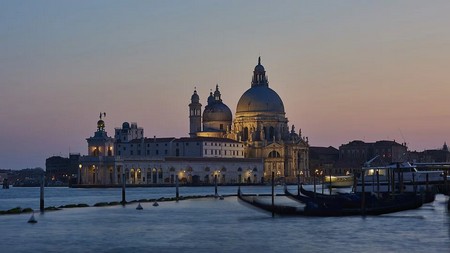
Photo source

*

I hope you enjoyed my post and thank you for viewing 🙂