
Hello dear Steemians,
*
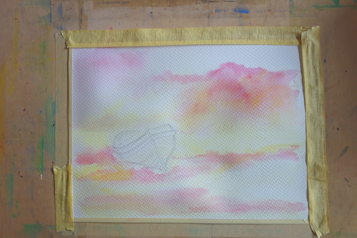
Today I decided to try something different with my watercolour paints. I saw some paintings of other artists and noticed that some of them have many different other colours except the main one and that made them look really nice, like a touch of yellow and pink. So I thought I will create my sky using these two colours as under-painting and keep them very pale, but to use the main colours and to see if my under-painting will be able to see.
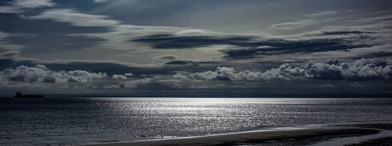
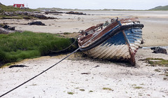
Of course for that I found a nice boat that I decided to place into my surrounding experiment.
*
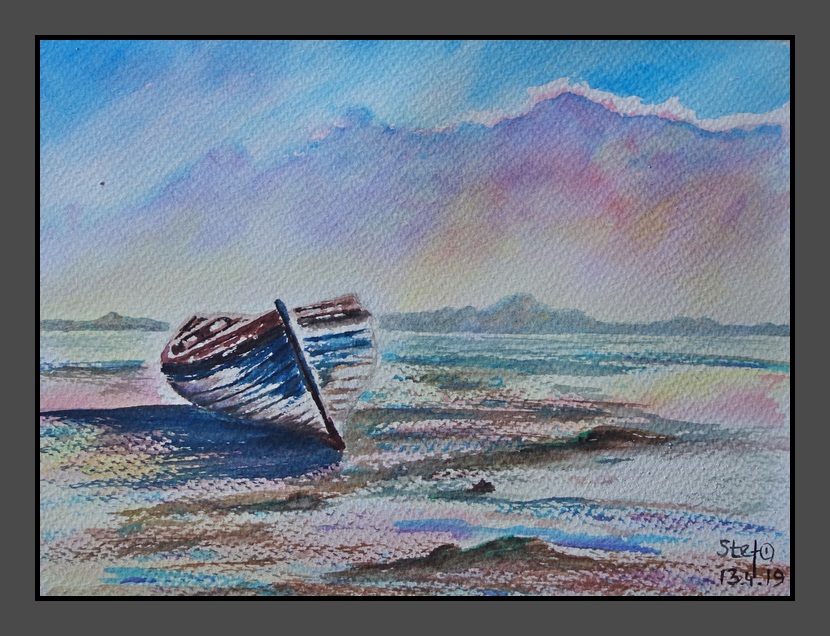
“Low tide” by @Stef1
What I noticed first two colours laid very nicely but then I had to use blue, actually I have four different blues and decided to use the one that is between blue and green may be that was not right. Unfortunately my blue wash in lower part of sky flow down with water and turned my lemon yellow in something like a Lime colour: yellow and green. I think in future I will try to avoid it. I like the way how my boat came out.
But I believe I have to think about the sand and shore, my son said too colourful coast 🙂

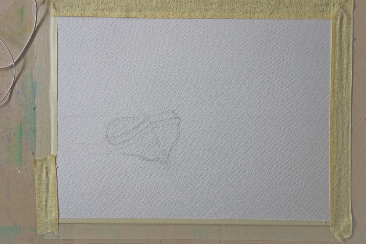
My step-by-step process:
Final painting:
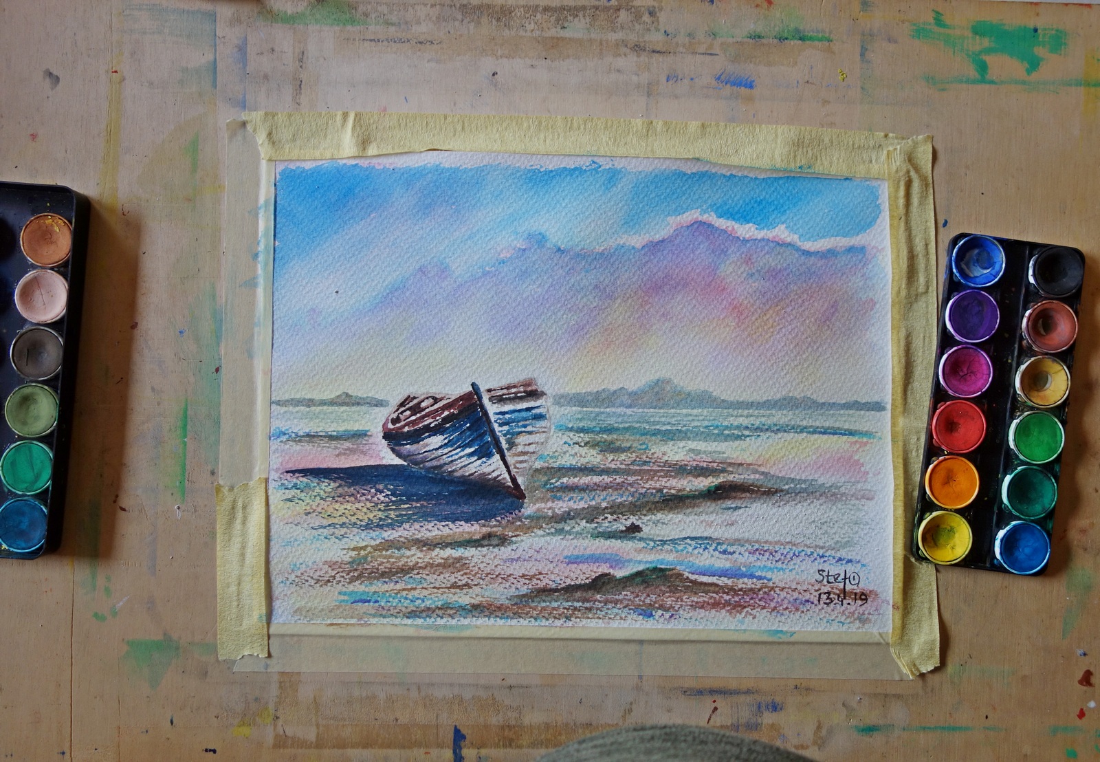
Watercolor painting “Low tide” by @Stef1
Rough watercolor textured paper 30×40 cm, paper weight 300 gsm, watercolors colors in pans and tubes, flat and round brushes
Photo source
*
I hope you enjoyed my post and thank you for viewing 🙂